
Mid-Am Building Solutions
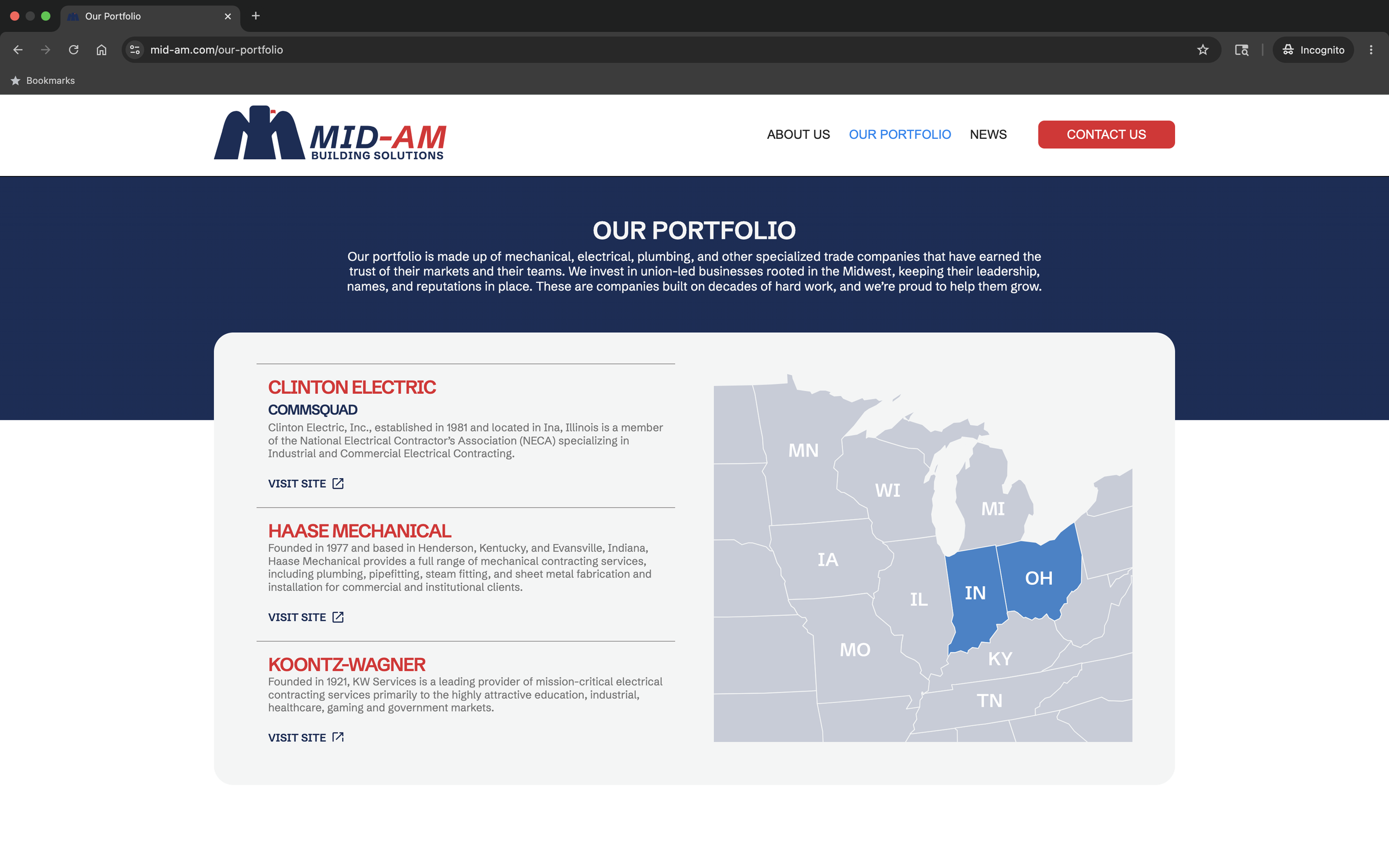
Clinton Electric, Haase Mechanical, Sexson Mechanical
As Mid-Am continued to grow its portfolio of operating companies, it needed a brand that could better reflect its long-term vision while creating consistency across the organization.
As Art Director and Brand Designer, I helped lead the brand refresh from strategy through execution, developing the brand foundation, verbal identity, visual system, website, and a framework that could scale across its family of companies.
RoleServicesBrand Strategy
Creative Direction
Multi-brand systems
Verbal Identity
Visual Identity
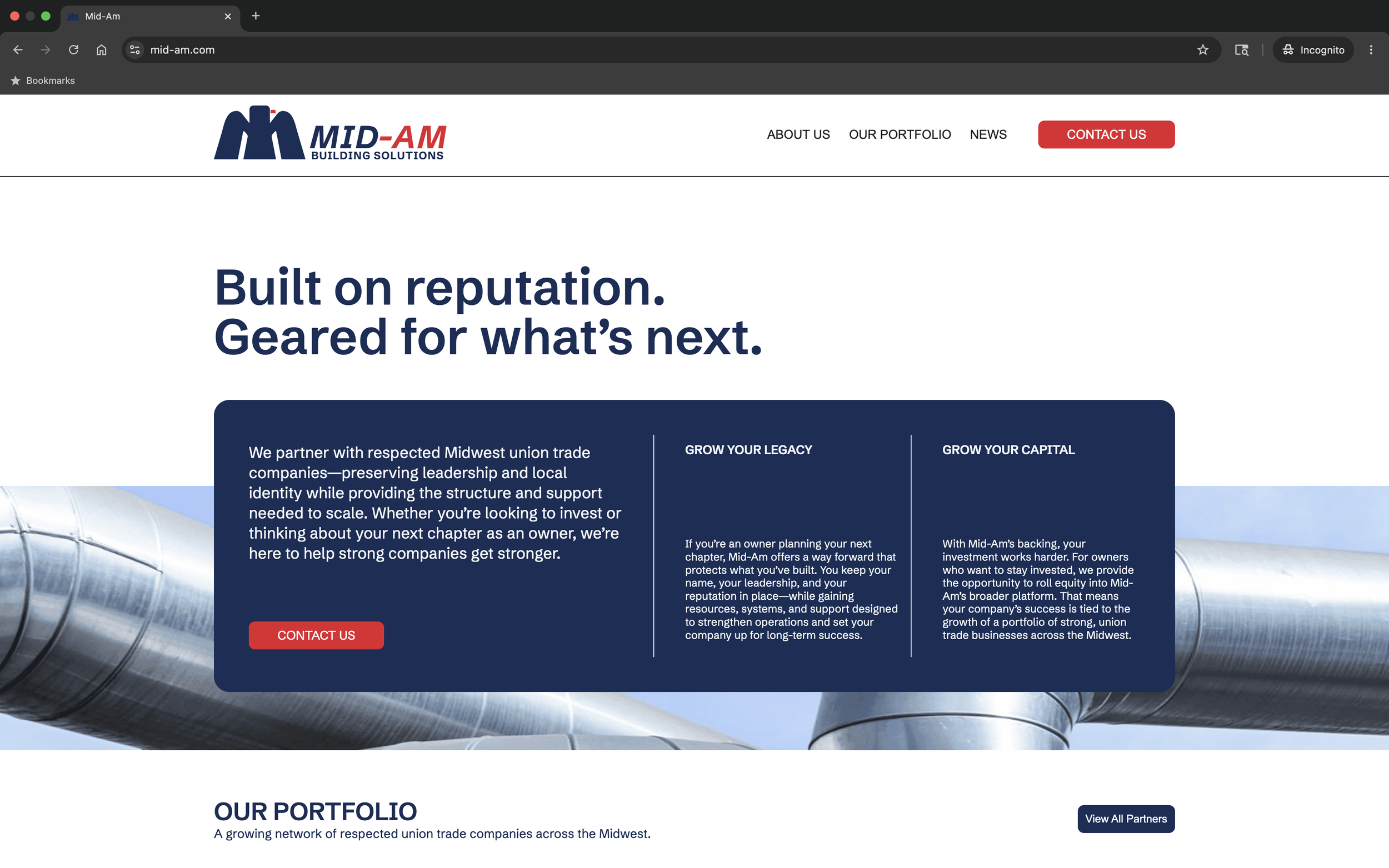
Website Design
Art Director & Brand Designer
Finding the Opportunity
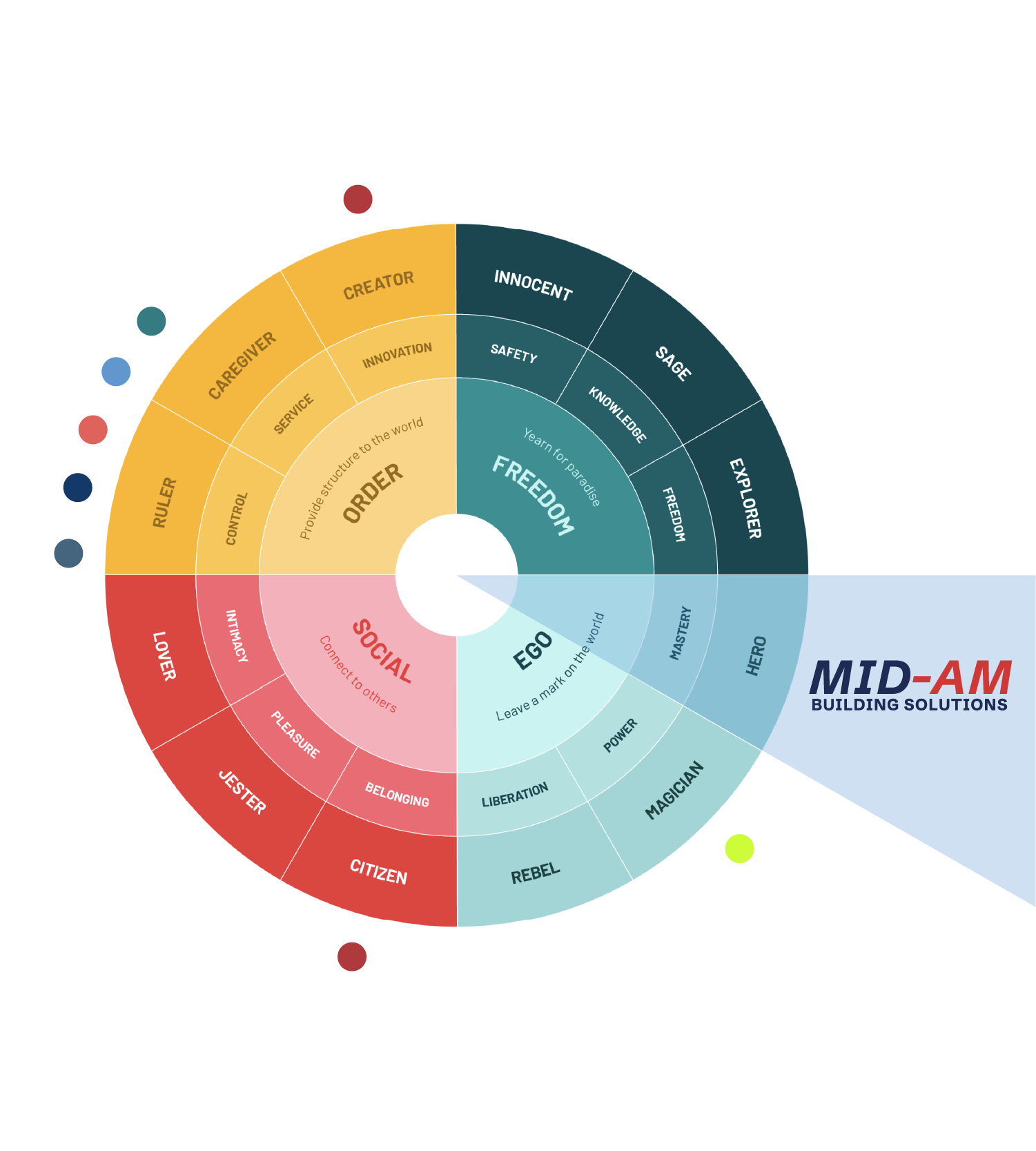
Most firms in the industry positioned themselves around capital, scale, and acquisitions, often feeling more like financial institutions than long-term partners.
Mid-Am had the opportunity to build a brand around preserving the legacy of Midwestern, union, and family-owned trade companies.
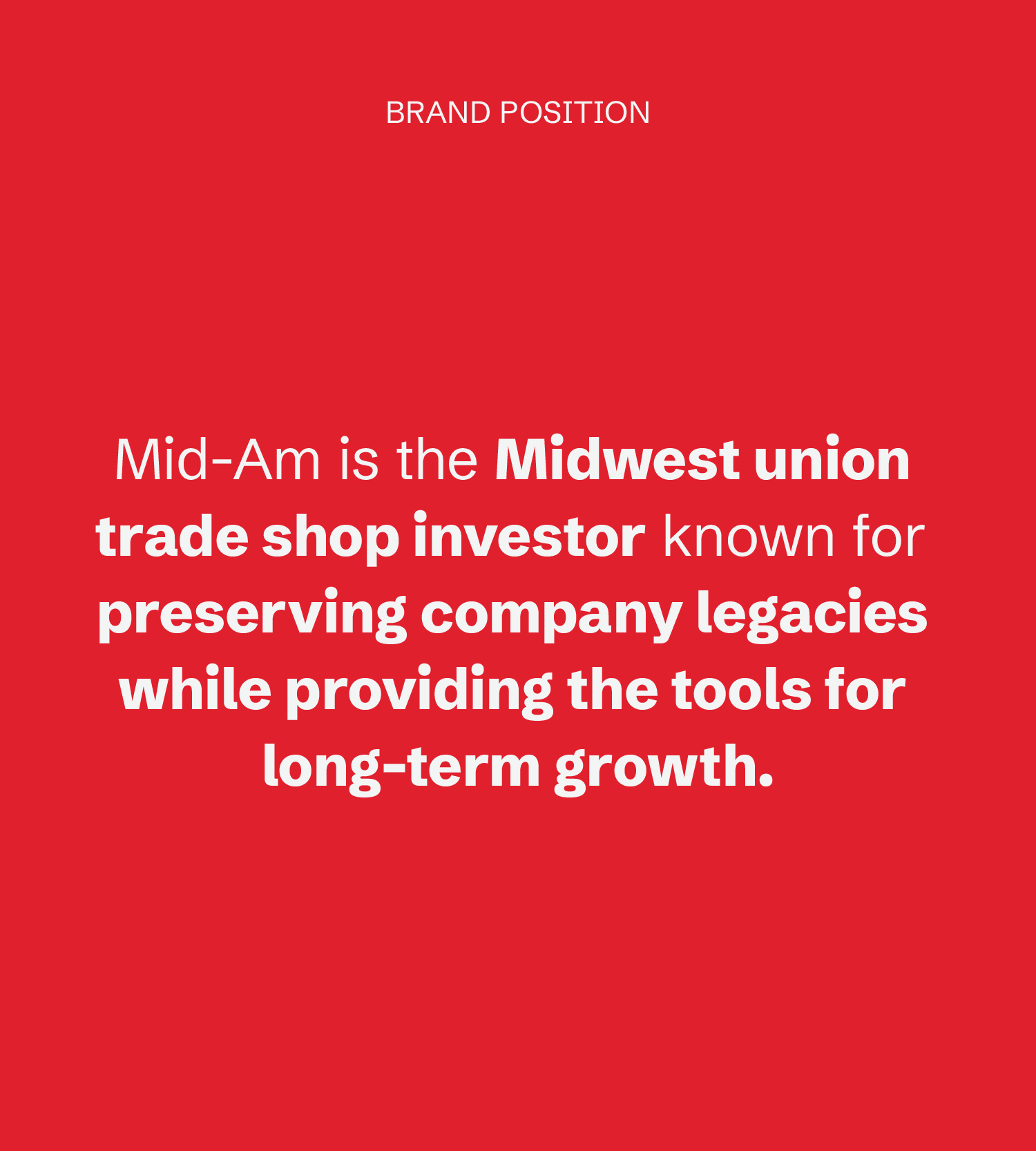
Verbal Identity
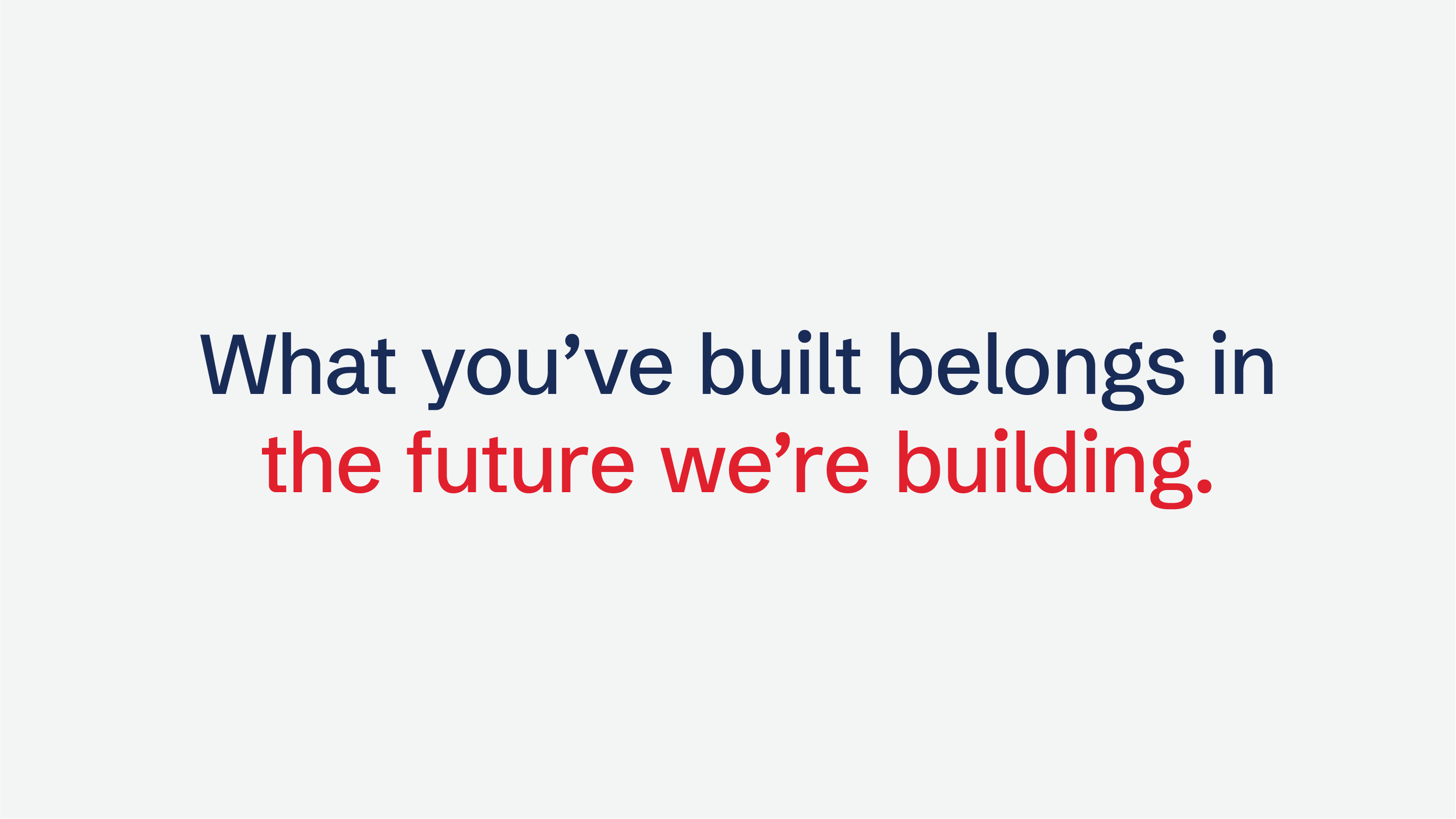
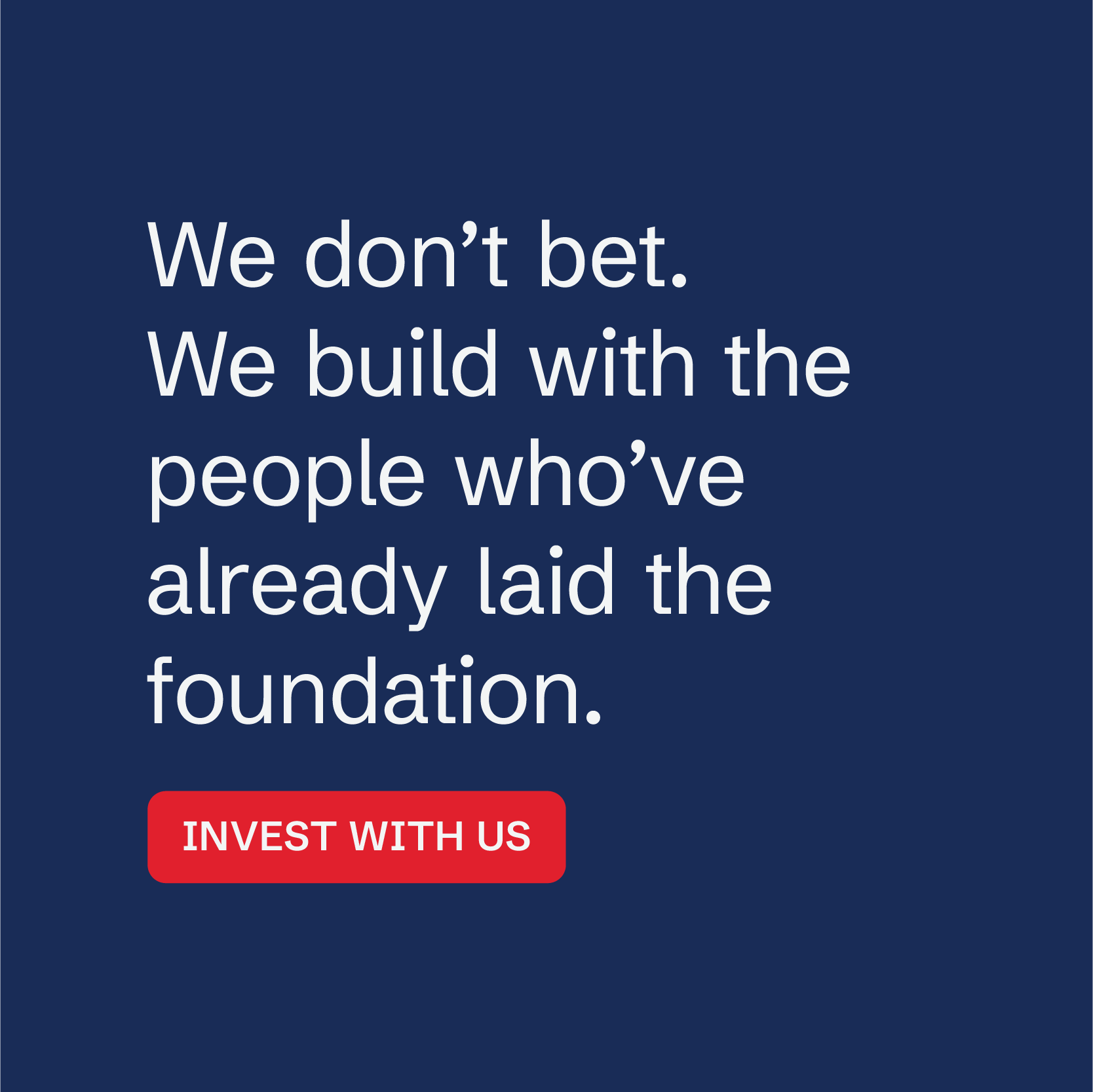
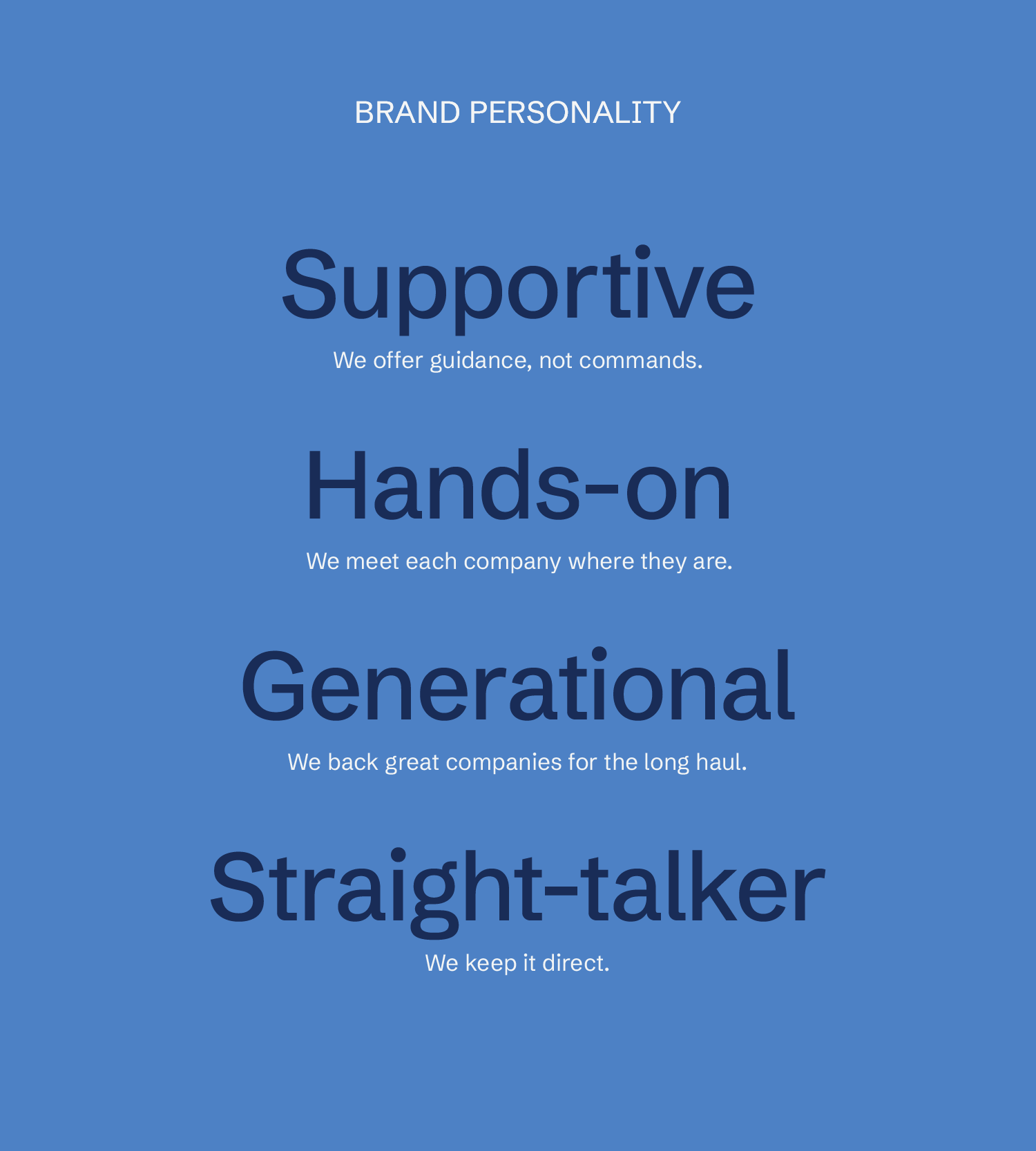
The verbal identity gave Mid-Am a voice that felt as grounded and approachable as the people behind the business. Instead of sounding like another investment firm, the messaging reinforced what set the brand apart: a hands-on partner committed to preserving what businesses had already built.
A defined set of personality traits and messaging examples established a consistent tone that could flex across every audience and application.
Visual Identity
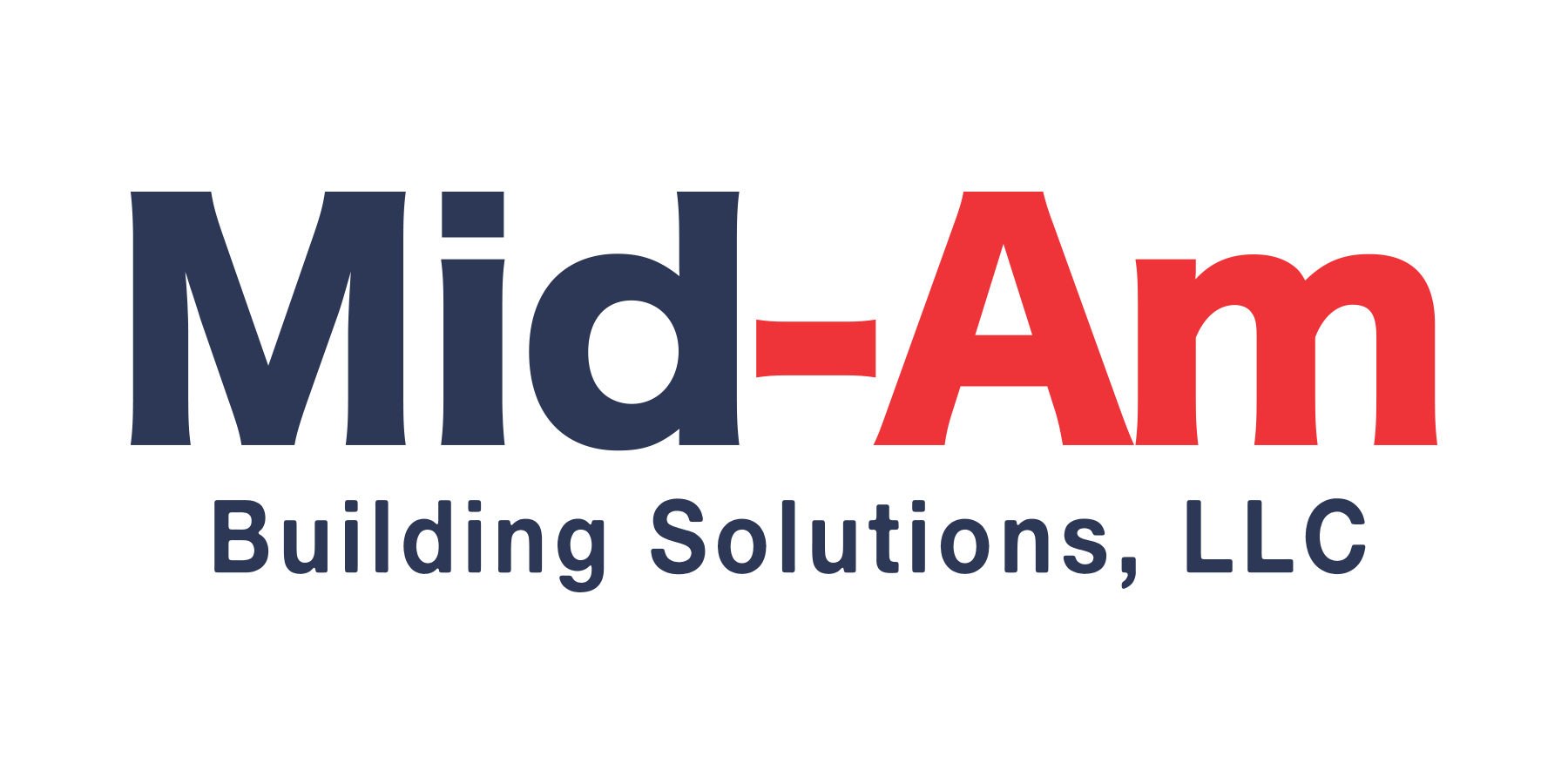
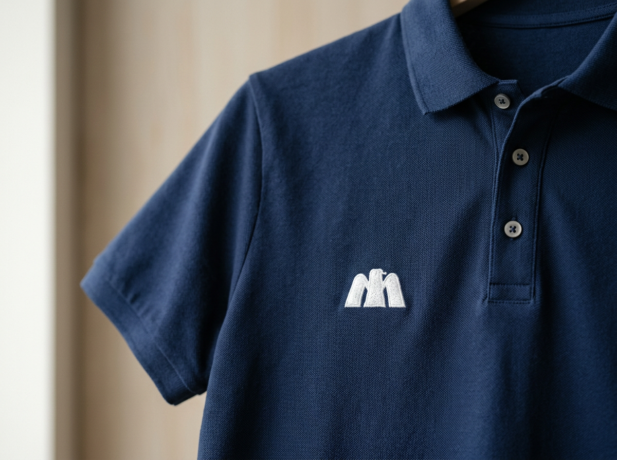
The identity was designed to reflect the people and communities at the heart of Mid-Am's business. Inspired by the grit and pride of the American Midwest, the system pairs a red, white, and blue palette with a bold eagle mark that feels both familiar and forward-looking.
Before
After


Building a Connected Portfolio
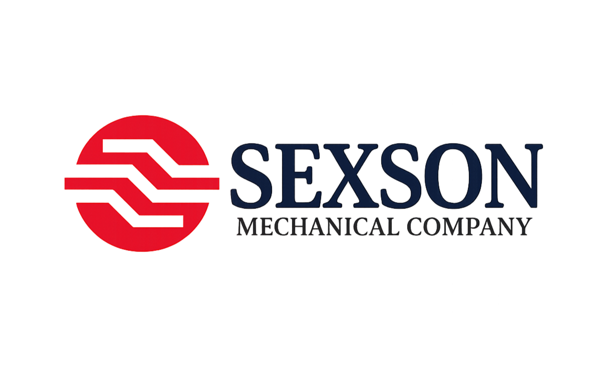
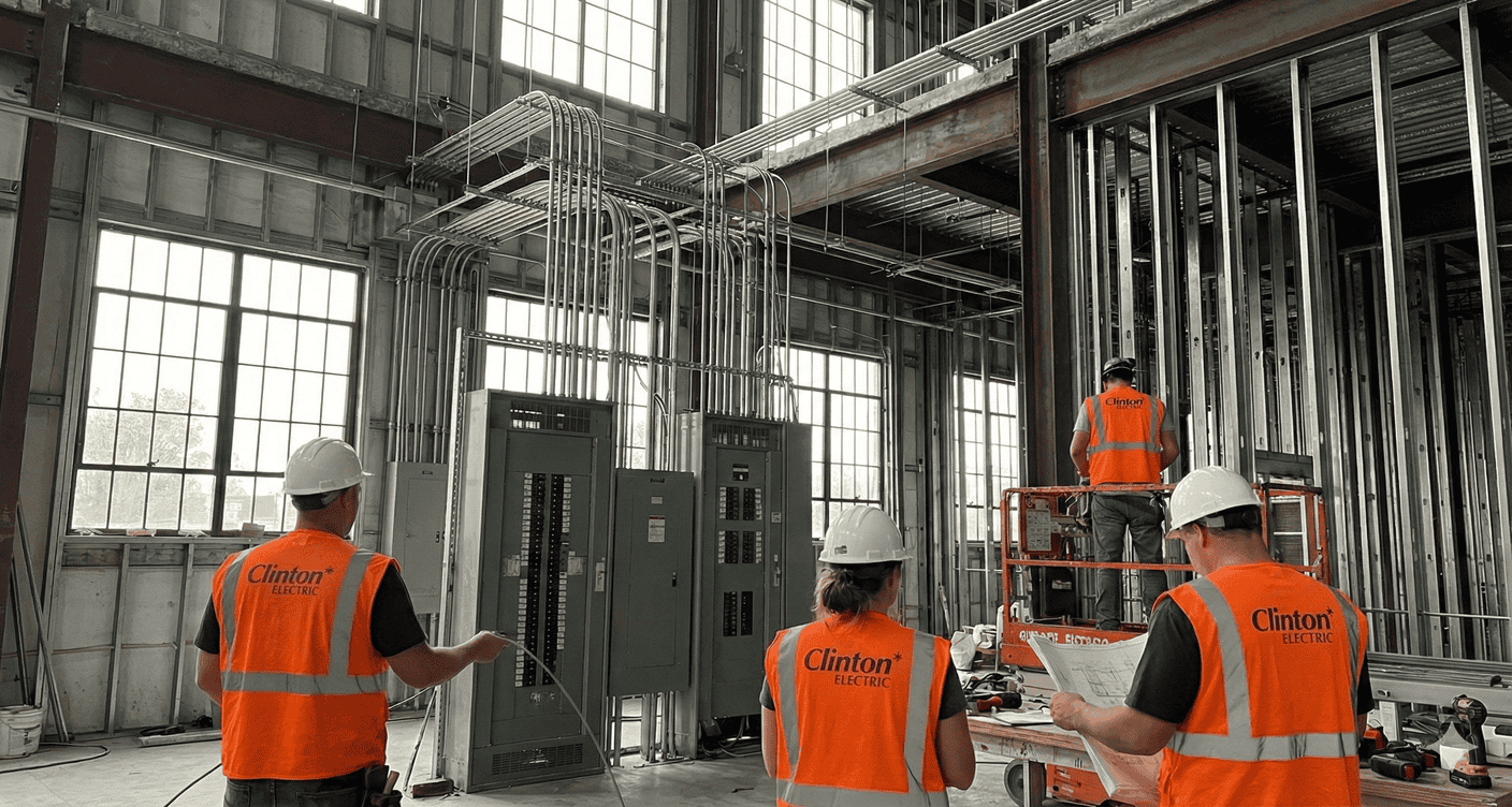
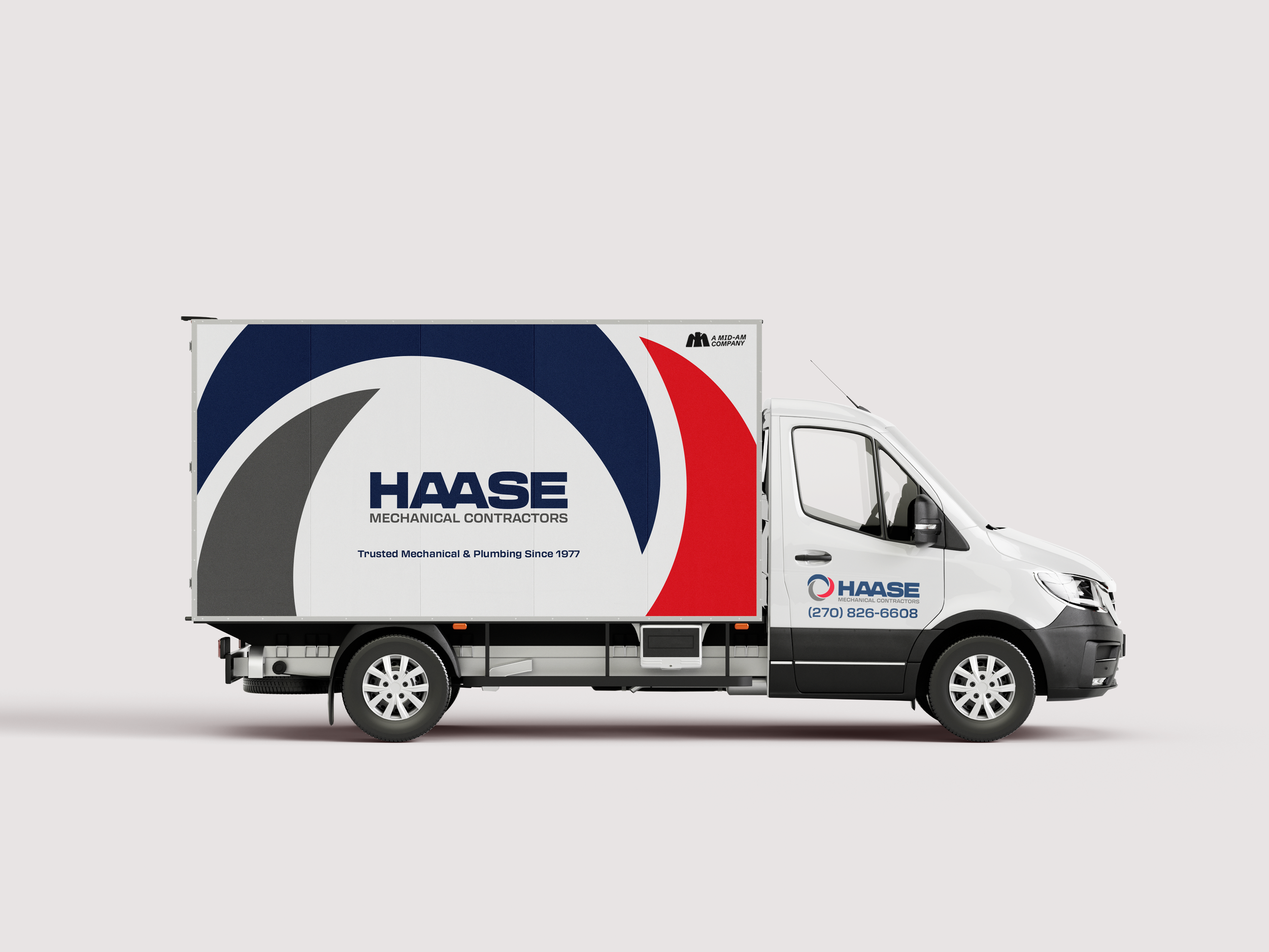
As Mid-Am has welcomed more companies into its portfolio, the goal has been to make the brand ecosystem feel more connected while still keeping the personality of each business intact. The refreshes focused on tightening things up visually with updated logos, typography, and a shared red, white, and blue palette that ties each company back to the larger Mid-Am brand.
Before

After
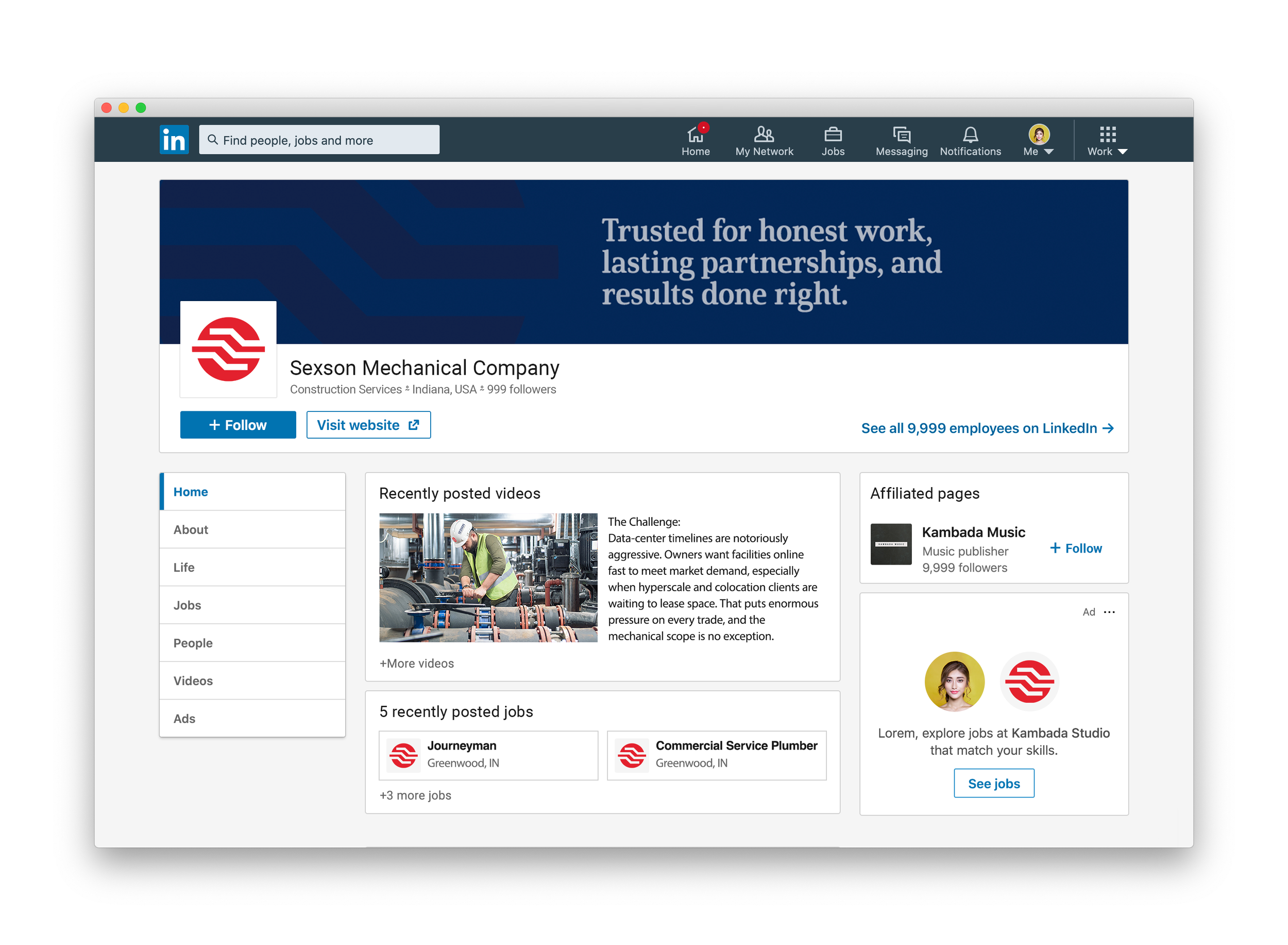
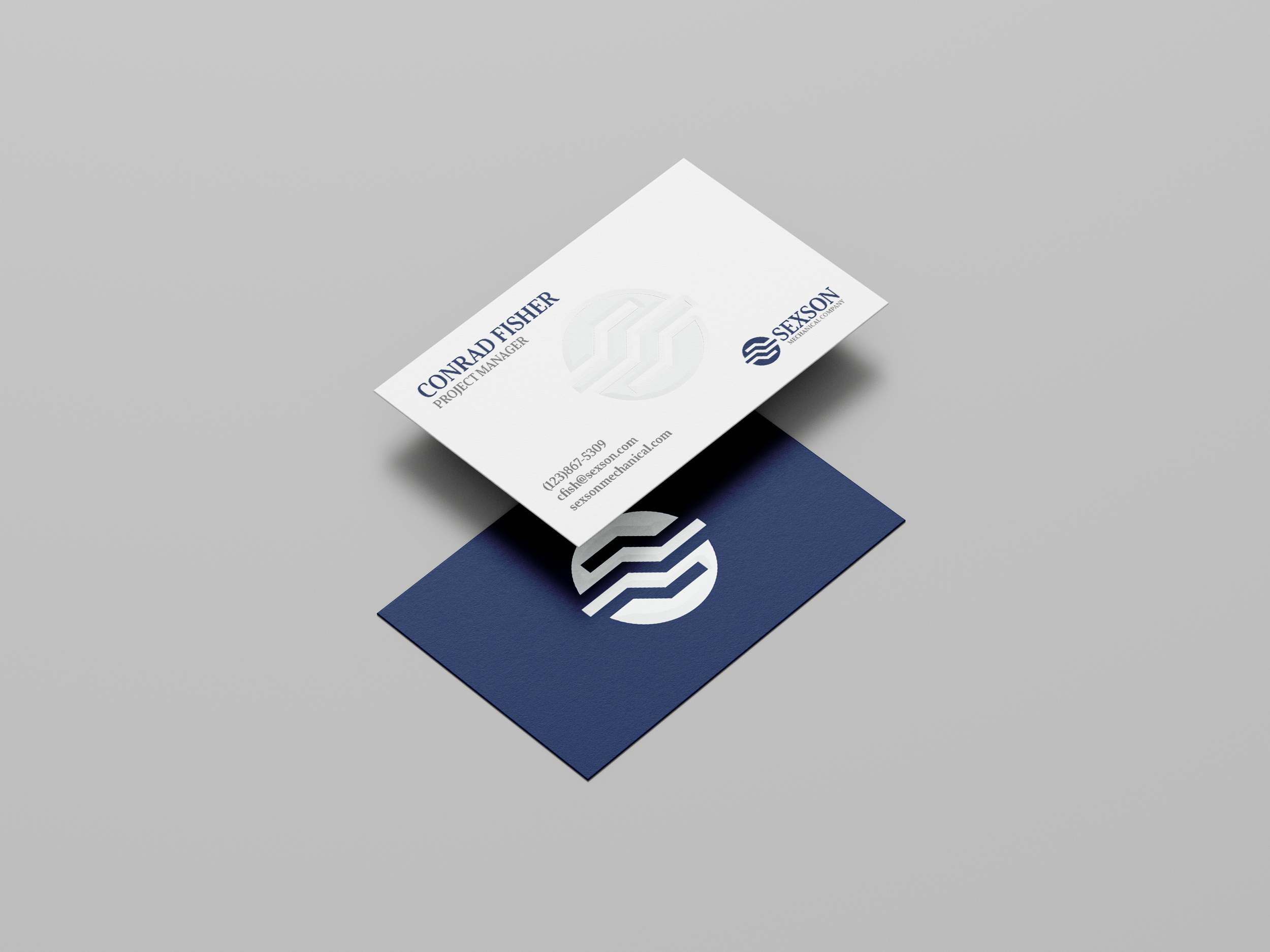
The Mid-Am modifier creates a consistent connection across the portfolio where context is needed.


Before
After

Before
After
What began as a visual refresh evolved into a comprehensive brand system that gives Mid-Am a stronger market presence today and a flexible foundation for the companies it will acquire.
CLIENT: Mid-Am Building SolutionsRole: Art Director & Brand DesignerAgency: TractionYear: 2025Credits